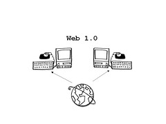
Need your input, please. I'm doing a virtual seminar next month, and I decided to go with a lo-fi look for the slides. This is an actual slide. Here's another. So what do you think? Different and cool or What the hell are you thinking?
Tags: Association; Association Management; Associations CAE; Certified Association Executive; conferences; meetings; powerpoint; presentation; web1.0
Hello, my name is...
Ben is an architect of participation; consulting, writing, speaking, and blogging to prepare you for a new era of association leadership.

5 comments:
Different and cool.
I guess I was thinking, what the hell can I do that would be different and cool. ;-)
I understand what you're thinking, but you could do this same concept and get a more interesting visual (color doesn't make it uncool, does it?) that doesn't look like you drew it on an overhead projector.
My vote...
different and cool. much more interesting than 12 pt. arial yellow type on blue background...snore.
Why not go all the way, use 12pt Courier on a white background? And use transparencies? ;-)
Also you should speak in a monotone and that might remind people of really boring presentations done by engineers circa 1990.
Post a Comment